

Documented Life Project 2014-
Planner, Week 12 challenge:
The prompt is to
"Cut up a magazine, add to page,"
Above, I used bits of floral patterns cut from
photos of clothing. I extended the
patterns onto the book text background
by drawing additional
bits of the motif in Sharpie pen.
Here is a tutorial on my process...

I found an advertisement with a promising looking
flower and some oval shapes. I also decided to
use a page of book text for background.

I cut out some of the oval shapes with scissors.
Then drew a black outline around the flower
with a black Sharpie pen. Be sure to let it
dry completely before cutting out. The glossy
paper tends to make the ink smear easily.
I saved the text for later use...

I chose to put my collage on the
watercolor paper tip-in on the right of
the spread, and applied a gray watercolor
wash to the paper. I chose gray because of the
decorative gray tape (you can see on the left)
that had been used when preparing
my planner. The use of a variety of tapes
was pretty random, and has been a fun
and interesting additional challenge each week.
Sometimes it affects my pages, and sometimes
I just kind of ignore it. I used yellow watercolor
with a bit of orange and brown on the
book text page because of the yellow
and golden magazine cut outs.

A strip of yellow fabric on my work surface
caught my eye, so I decided to use that also.
The brownish-golden shapes seem too dark
for my taste...
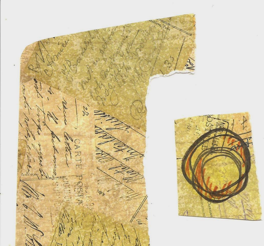
so I decided to try using a bit of scrapbook paper,
and drawing a wonky circle on it. I tried applying
yellow watercolor, but the surface was a bit too glossy
for it to work well, so I dabbed it with a napkin and
used an orange marker to add some color.

Some more scrapbook paper with
polka dots and stripes brightened things up
a bit, and after moving things around on the
page, I decided to glue them down in a
staggered configuration on the page.
The darker magazine ovals went behind
the other shapes for an 'outline' effect.

I added magazine letters to spell out
'Color Therapy.' Almost done!
Next, I want to add drawing, to
help blend the collage elements
with the background.

I drew leaves, branches of berries,
and added more 'wonky' outlines around
the scrapbook circles. I drew an outline
and shadows beneath the letters. I always
put the shadow on the right and below...
I formed that habit in high school when we
had a unit on lettering and calligraphy!

Finally, I added a bit more black watercolor,
very lightly so it would be gray, where I had
drawn the diagonal lines for shadows,
and along the strip of fabric on the right.
I painted leaves along the left margin to
echo the pattern of the tape, and added
yellow highlighter to the berries.
I usually try to have repetition of shapes
and color in my collages, and have an
odd number of shapes as well. (but not always!)
I think asymmetrical is more interesting.

I am thoroughly enjoying my
Documented Life planner...
not that I live that interesting a life,
but it reminds me to enjoy and
take note of day-to-day things,
and be grateful for them.
Visit Art to the 5th blog
for more inspiration!
♥ ♥ ♥
Note~
I built my own planner from various types
of paper, punching holes into the pages
as you would for a ring binder, and
binding them together with book rings.
Each week of the year had a page for
the dates of the week on the left side of
the spread, on which you could
journal about your daily life and activities.
In addition, a second page on the right side
of the spread had a 'tip-in' created by
taping on an additional page that would
flip open for additional art work or journaling.
As the weeks went by, the journal become
fatter and fatter, so that I ended up
having to purchase bigger book rings.
But I was delighted with the results!
What a wonderful tutorial! Thanks for sharing!
ReplyDeleteI love DLP too!
I liked your tutorial so much I shared the link with the members of the class I taught in January. I liked the idea of showing people how to fix things you weren't happy with, that can be a big one for beginners. It was great, thank you.
ReplyDeleteLove seeing your step by step. All that bright color is what we need while waiting for this spring I've been hearing is supposed to be here--LOL! ;)
ReplyDeleteI was really impressed with your tutorial. I need to remember that the ink smears and keep my hand out of its reach. Thanks for that lesson (grin). You did an excellent job, and I love the artwork you added along with your magazine images. Beautiful outcome.
ReplyDeleteWonderful tutorial. I'm so impressed that you got a picture for each step! The way you use your drawing to pull the piece together is what really gets me...It was good before but the drawing makes it outstanding.
ReplyDeleteAnd I love that you use the word wonky too. :)
I LOVE THIS!!!
ReplyDelete