Showing posts with label pastels. Show all posts

Wednesday, March 9, 2011

Inspirations for Art Journaling


Inspiration for these journal pages came
from a fashion magazine, the phrase
"pear-shaped figure," and an affection for
paper dolls and interesting quotes.
I couldn't resist putting the pear-shaped
body beneath the fashion-ad inspired head,
when in the glossy magazines, they
are usually pencil-thin!

The woman's figure was painted in
watercolor on watercolor paper, then cut
out and glued onto the page.
A watercolor background was
shaded with soft pastels after
adding the text in Sharpie marker
and mauve gel pen.
The pose of the figure is not ballet...
I have been in physical therapy for a
frozen shoulder, and this is a
painful reminder of the stretches I
must do to get back my mobility!


Again, a page motivated by a fashion magazine.
I find the graphics, layouts and photography
quite inspiring, though the clothes are 
often just weird.  The turban is inspired
by African styles, and the flowers are
inspired by American folk-art designs.
If you've ever looked at Pennsylvania
Dutch designs or early American
birth and marriage certificates, 
they can provide a wealth of ideas for
art journals and decoration.


Wednesday, March 4, 2009

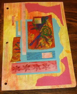
THE PROCESS-- Mixed Media Collage

MATERIALS:
Recycled cardboard
Gesso
Artist's chalk pastels
"Suave" max hold hairspray (or any inexpensive brand)
Scissors, glue, Sharpie marker
Papers, paint, fabric, ephemera
Hole punch, if desired

Recycle cereal box or other cardboard for substrate.
Cut to size & shape desired. Apply gesso, 1-2 coats.
Apply chalk pastels in desired colors.
"Fix" with inexpensive hairspray. (This is
to help prevent smearing of the chalk)


Choose scraps of fabric, paper, painted papers
to include in the composition.
Color contrast was a main consideration
for this piece. Lay out without gluing
and try several compositions.
Cut, tear, and overlap shapes.


Begin gluing shapes after experimenting with
color contrast, overlap, and how your eye
is guided through the page.
In the western world, our eye is usually
trained to "read" the composition from
(upper) left to right, top to bottom.
Try to guide the eye through the page
by the balance and movement
of shapes, colors, space & contrast.


I usually repeat some colors and shapes
throughout the surface, often using
something an odd number of times,
as in 3 times, or 5 times...
but it's not an absolute...
My process is intuitive.


"Connected" - Pink & Blue Collage

Often, it is difficult to know when the
composition is finished!
Some artists suggest that the artwork
is never "done" it just stops in
an interesting place...
I added layers of undulating lines
to suggest "strata" with
an extra-fine point Sharpie marker.
I used a hole punch to punch holes in this piece
to put into a "ring binder art journal."

Ingrid has been recycling cardboard
to create stunning journal pages in
a recycled ring binder. She has inspired me
to create my own version.
Please visit Ingrid's blog to see her
beautifully executed journals!

Wednesday, January 28, 2009

Shape Up!

Michelle Ward's GPP Street Team Blog
Crusade No. 27 is called
Shape Up!
She challenged us to explore
a shape: think positive & negative,
large & small...

These Art Journal pages were first painted
with watercolors for the background.
Primitive bird shapes were cut
from paper and then pastels
applied to the bird shape. I laid
the shape onto the journal page
and rubbed the pastel from
the stencil onto the journal
page, creating a stencil of the negative
shape. Hand-carved bird stamps
were added & quotes in calligraphy.
I also included the stencil shapes
by gluing them to the page as well.