Showing posts with label composition. Show all posts

Tuesday, July 28, 2015

Tutorial for Collage


How do you create a collage?
There is more than one way to
approach any art process...
but here I will share one of
the ways that I create collage
in my visual art journals.


1.) Apply watercolor to the page. Notice that for this particular background I did not blend the colors into one another, but left 'hard edges', (not blended) or even a little white space between colors.


2.) Collect/choose an assortment of papers and images that could be used in the collage. I usually use the background colors as a guideline.  Above: ledger paper, graph paper, stamped cardstock, my drawings with watercolor on cardstock, vintage game piece images, fabric, scrapbook paper, and a random ticket. Not all of them will end up in the final collage. Part of the fun for me is sorting through what I have on hand.

The possibilities for use of ephemera are pretty much endless!  From junk mail to vintage photos, the images you choose to use in your work will give the collage its own unique quality.


3.)  Arrange your chosen collage elements on the background.  This will take some trial and error. Move around the shapes and images, until satisfied with the arrangement.

Once I chose the bee image, that suggested the leaves and the flower. "Tea with honey" and the little tea cup drawing were chosen to go along with the T Tuesday theme over at The Altered Book Lover Blog. 

Various printed papers, like the ledger and graph paper give additional texture and color to the composition. I also like lined yellow or white writing paper. I've included a scrap of tissue-box-cardboard (blue behind the flower) and my own painted and drawn doodles. The British stamp was chosen simply for color and shape. Color is usually the dominant factor that helps me choose the collage elements.


4.) Add lines in pen to the background.  This helps unify the collage elements with the background.  (At this point, other mediums could also be added: pencil, pastel, acrylic paints, etc.  I chose to keep the number of layers to a minimum)

The overall flow of the shapes, spaces, lines and color should keep your eye moving over the surface of the collage. With collage, if something isn't quite working, you can remove it and replace it with something else, or just cover it up with paint or another piece of paper.


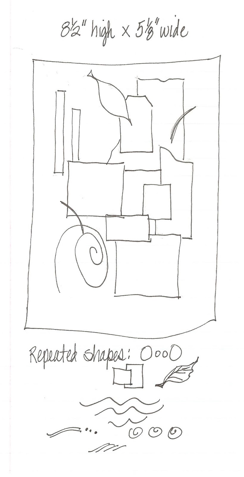
Here's a diagram of the shapes I've chosen and how the basic layout forms somewhat of an oval to guide your eye through the collage...


Since we read from left to right, our eye tends to also read the composition of an art work in the same way.  I keep that in mind and try to make an 'easy entry' point in the upper left hand corner of the work.  Of course, Eastern art and writing don't read from left to right, so it all depends on how you choose to work.  As we often are reminded, there is no 'right' or 'wrong' in art.


Linking up with 
Bleubeard and Elizabeth
for the T Tuesday link-up party.
All you have to do is include
a reference to a beverage to
join in.  Tea is good, but I am
a coffee lover too! Share a photo,
poem, art work, recipe or anything 
beverage related.  Maybe even
a tutorial?!


Enjoy your tea with honey...
and enjoy some art
with collage.


Friday, June 28, 2013

Science Collages on Index Cards~ 2013


 Mini collages on index cards with
science illustrations from an old book,
and assorted ephemera...


I drew the sprig of flowers in the
upper right corner to repeat the 
motif in the pink scrapbook paper.
The pink flower on the lower right is
my own drawing with watercolor.
The illustration of the man is from a
vintage book that I bought at 
a library sale--a great resource!


More bits of ephemera: text, book illustration,
postage stamp, scrap of soda pop carton, drawings,
and brown paper with paint. It's fun to add the
pen-drawn 'shadows' around the edge of 
some of the shapes, and I have to resist the
urge to do it on every collage!


I am not sure where the Asian lady came from-
perhaps a collage pack?  This collage includes
yellow fabric across the center.


When I create a collage, I try to 'lead the eye'
from left to right across the surface of the
collage.  The viewer's eye can be directed
by the lines, placement of colors and shapes,
and even the edges and open spaces
within the collage.


I also try to repeat some of the colors,
shapes, or motifs within the collage.
Here, there is a repetition of rectangular shapes,
circular shapes, dots, and the color green.


Collages often look 'random,' but I
 put them together intuitively with the
balance of shapes and colors in mind. Above,
 there is a 'stair step' of shapes from the
 upper left down to the phrase 'Modern Life.'
The circular diagram and the tree motif 
on the right keep our eyes from 'falling
off the page' on the extreme right. Our eye
is guided back up into the text and we
can again look across the surface of the 
collage comfortably as many times as we like.
Contrasting unrelated or unexpected 
images gives a fun quality to the piece.

So glad you stopped by --
I hope you enjoyed your visit!  Your
comments are appreciated more than you know...

There are many more artists doing the
ICAD 2013 challenge. Visit Daisy Yellow,
to see more great art on index cards!


Tuesday, April 24, 2012

Fake Journal: Realism Not Required


'Fake Journal' entry created
first with pencil sketch, then 
painted in gouache.


Transcript of the above:

The Way of Tea exemplifies elegant
simplicity...beauty need not require opulence.
But the Way of Tea has become rigid ceremony...

Strict adherence to reality is not required.
Asymmetry is beauty. Omitting background
details is quite permissible to give the subject
prominence. The rhythm and variety of
negative space enrich the composition.

Why not simplify the subject to its essence?


Wednesday, March 4, 2009

THE PROCESS-- Mixed Media Collage

MATERIALS:
Recycled cardboard
Gesso
Artist's chalk pastels
"Suave" max hold hairspray (or any inexpensive brand)
Scissors, glue, Sharpie marker
Papers, paint, fabric, ephemera
Hole punch, if desired

Recycle cereal box or other cardboard for substrate.
Cut to size & shape desired. Apply gesso, 1-2 coats.
Apply chalk pastels in desired colors.
"Fix" with inexpensive hairspray. (This is
to help prevent smearing of the chalk)


Choose scraps of fabric, paper, painted papers
to include in the composition.
Color contrast was a main consideration
for this piece. Lay out without gluing
and try several compositions.
Cut, tear, and overlap shapes.


Begin gluing shapes after experimenting with
color contrast, overlap, and how your eye
is guided through the page.
In the western world, our eye is usually
trained to "read" the composition from
(upper) left to right, top to bottom.
Try to guide the eye through the page
by the balance and movement
of shapes, colors, space & contrast.


I usually repeat some colors and shapes
throughout the surface, often using
something an odd number of times,
as in 3 times, or 5 times...
but it's not an absolute...
My process is intuitive.


"Connected" - Pink & Blue Collage

Often, it is difficult to know when the
composition is finished!
Some artists suggest that the artwork
is never "done" it just stops in
an interesting place...
I added layers of undulating lines
to suggest "strata" with
an extra-fine point Sharpie marker.
I used a hole punch to punch holes in this piece
to put into a "ring binder art journal."

Ingrid has been recycling cardboard
to create stunning journal pages in
a recycled ring binder. She has inspired me
to create my own version.
Please visit Ingrid's blog to see her
beautifully executed journals!